

The Art of Agile Development: Informative Workspace
July 15, 2010

The second edition is now available! The Art of Agile Development has been completely revised and updated with all new material. Visit the Second Edition page for more information, or buy it on Amazon.
- Next: Root-Cause Analysis
- Previous: Energized Work
- Up: Chapter 5: Thinking
in 99 words
An informative workspace is about information and accessibility. Surround yourself with information. Pay attention to the mood and buzz in the room. Create big charts and plans that graphically show your progress.
Use hand-drawn charts, posted prominently, to ensure that information is constantly visible and easily modified. Don't let a spreadsheet or project management tool constrain what you can track.
Beware of gaming. To prevent it, discuss charts as a team. Review their use often and take them down after a few iterations. Don't report workspace charts outside of the team and never use them in performance evaluations.
as haiku
Little plastic nubs...
tiny green leaves; together,
meaning in the dirt
Commentary
Full Text
The following text is excerpted from The Art of Agile Development by James Shore and Shane Warden, published by O'Reilly. Copyright © 2008 the authors. All rights reserved.
Informative Workspace
- Audience
- Whole Team
We are tuned in to the status of our project.
Your workspace is the cockpit of your development effort. Just as a pilot surrounds himself with information necessary to fly a plane, arrange your workspace with information necessary to steer your project: create an informative workspace.
An informative workspace broadcasts information into the room. When people take a break, they will sometimes wander over and stare at the information surrounding them. Sometimes, that brief zone-out will result in an aha moment of discovery.
An informative workspace also allows people to sense the state of the project just by walking into the room. It conveys status information without interrupting team members and helps to improve stakeholder trust.
Subtle Cues
Simply poking your head into a project room should give you information about the project.
The essence of an informative workspace is information. One simple source of information is the feel of the room. A healthy project is energized. There's a buzz in the air—not tension, but activity. People converse, work together, and make the occasional joke. It's not rushed or hurried, but it's clearly productive. When a pair needs help, other pairs notice, lend their assistance, then return to their tasks. When a pair completes something well, everyone celebrates for a moment.
An unhealthy project is quiet and tense. Team members don't talk much, if at all. It feels drab and bleak. People live by the clock, punching in and punching out—or worse, watching to see who is the first one to dare to leave.
Besides the feel of the room, other cues communicate useful information quickly and subconsciously. If the build token is away from the integration machine, it's not safe to check out the code right now. By mid-iteration, unless about half of the cards on the iteration plan are done, the team is going faster or slower than anticipated.
You can never have too many whiteboards.
An informative workspace also provides ways for people to communicate. This usually means plenty of whiteboards around the walls and stacks of index cards. A collaborative design sketch on a whiteboard can often communicate far more quickly and effectively than a half-hour PowerPoint presentation. Index cards are great for Class-Responsibility-Collaborator (CRC) design sessions, retrospectives, and planning with user stories.
Whiteboard design sessions labelled "Do Not Erase" for more than a few days may indicate a problem. Any programmer on the team should be able to re-create the design from memory, perhaps with a bit of help from reviewing the source code. If permanent design diagrams are indispensible, you may benefit from simplifying your design and sharing code ownership.
Big Visible Charts
An essential aspect of an informative workspace is the big visible chart. The goal of a big visible chart is to display information so simply and unambiguously that it communicates even from across the room.
The iteration and release planning boards are ubiquitous examples of such a chart. You'll see variants of these planning boards in every XP project. For more information about these boards, see the release planning board shown in Figure 8-4 and the iteration planning board shown in Figure 8-9.
Another useful status chart is a team calendar, which shows important dates, iteration numbers, and when team members will be out of the office (along with contact information, if appropriate). A large plastic perpetual calendar, available at most office supply stores, works well here.
Hand-Drawn Charts
Don't rush to computerize.
Avoid the reflexive temptation to computerize your charts. The benefits of the informative workspace stem from the information being constantly visible from everywhere in the room. It's difficult and expensive for computerized charts to meet that criterion; you'd have to install plasma screens or projectors everywhere.
Even if you can afford big screens everywhere, you will constantly change the types of charts you display. This is easier with flip charts and whiteboards than with computers, as creating or modifying a chart is as simple as drawing with pen and paper. Don't let a spreadsheet or project management software constrain what you can track.
Process Improvement Charts
- Ally
- Retrospectives
One type of big visible chart measures specific issues that the team wants to improve. Often, the issues come up during a retrospective. Unlike the planning boards or team calendar, post these charts only as long as necessary.
Create process improvement charts as a team decision and maintain them as a team responsibility. When you agree to create a chart, agree to keep it up to date. For some charts, this means taking 30 seconds to mark the board when the status changes. Each team member should update his own status. Some charts involve collecting some information at the end of the day. For these, collectively choose someone to update the chart.
There are many possible types of process improvement charts; they take forms as diverse as the types of problems that teams experience. The principle behind all of them is the same: they appeal to our innate desire for improvement. If you show progress towards a mutual goal, people will usually try to improve their status.
I try to create charts in which a line going up or a box filled in indicates improvement. It's a small way to improve clarity. Don't knock yourself out trying to follow this guideline, though: it's more important to get back to work than it is to twist your measurements to make a line go up rather than down.
Consider the problems you're facing and what kind of chart, if any, would help. As an example, XP teams have successfully used charts to help improve:
Amount of pairing, by tracking the percentage of time spent pairing versus the percentage of time spent flying solo
Pair switching, by tracking how many of the possible pairing combinations actually paired during each iteration (see Figure)
Build performance, by tracking the number of tests executed per second (see Figure)
Support responsiveness, by tracking the age of the oldest support request (an early chart, which tracked the number of outstanding requests, resulted in hard requests being ignored)
Needless interruptions, by tracking the number of hours spent on non-story work each iteration
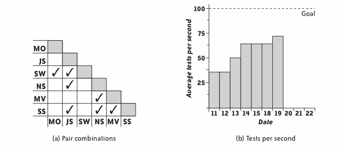
Figure. Sample Charts
Try not to go overboard with your process improvement charts. If you post too many, they'll lose their effectiveness. My maximum is three to five charts. That's not to say that your only decorations should be a handful of charts. Team memorabilia, toys, and works in progress, are also welcome. Just make sure the important charts stand out.
Gaming
While having too many process improvement charts can reduce their impact, a bigger problem occurs when the team has too much interest in a chart, that is, in improving a number on a chart. They often start gaming the process. Gaming occurs when people try to improve a number at the expense of overall progress.
For example, if programmers focus on too much on improving the number of tests in the system, they might be reluctant to remove out-of-date tests, making maintenance more difficult, or they might add unnecessary or redundant tests. They may not even realize they're doing so.
To alleviate this problem, use process improvement charts with discretion. Discuss new charts as a team. Carefully tie charts to the results you want to see. Review their use often and take them down after an iteration or two. By that time, a chart has either done its job or it isn't aren't going to help.
Never use workspace charts in a performance evaluation.
Above all, never use workspace charts in performance evaluations. Don't report them outside the team. People who feel judged according to their performance on a chart are much more likely to engage in gaming. See Reporting in Chapter 6 for ideas about what to report instead.
Questions
We need to share status with people who can't or won't visit the team workspace regularly. How do we do that without computerized charts?
A digital camera can effectively capture a whiteboard or other chart. You could even point a webcam at a chart and webcast it. Get creative.
- Ally
- Reporting
Remember, though, that most information in the team workspace is for the team's use only. Reporting team progress outside of the team is a separate issue.
Our charts are constantly out of date. How can I get team members to keep them up-to-date?
The first question to ask is, "Did the team really agree to this chart?" An informative workspace is for the team's benefit, so if team members aren't keeping a chart up-to-date, they may not think that it's beneficial. It's possible that the team is passively-aggressively ignoring the chart rather than telling you that they don't want it.
If people won't take responsibility, perhaps you're being too controlling.
I find that when no one updates the charts, it's because I'm being too controlling about them. Dialing back the amount of involvement I have with the charts is often enough to get the team to step in. Sometimes that means putting up with not-quite-perfect charts or sloppy handwriting, but it pays off.
If all else fails, discuss the issue during the retrospective or a stand-up meeting. Share your frustration and ask for the team's help in resolving the issue. Prepare to abandon some favorite charts if the team doesn't need them.
Results
When you have an informative workspace, you feel like you have up-to-the-minute information about all of the important issues your team is facing. You know exactly how far you've come and how far you have to go in your current plan. You know whether the team is progressing well or having difficulty, and you know how well you're solving problems.
Contraindications
If your team doesn't sit together in a shared workspace, you probably won't be able to create an effective informative workspace.
Alternatives
If your team doesn't sit together, but has adjacent cubicles or offices, you might be able to achieve some of the benefits of an informative workspace by posting information in the halls or a common area. Teams that are more widely distributed may use electronic tools supplemented with daily stand-up meetings.
A traditional alternative is the weekly status meeting, but I find these dreary wastes of time that delay and confuse important information.
Further Reading
Agile Software Development [Cockburn] has an interesting section on "Convection Currents of Information" that describes information as heat and big visible charts as "information radiators."
- Next: Root-Cause Analysis
- Previous: Energized Work
- Up: Chapter 5: Thinking